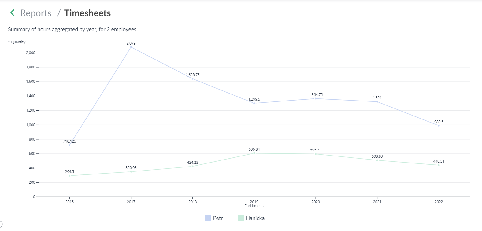
If you want to compare multiple sources of data in one chart, e.g. employee performance, salespeople comparison, or compare expenses from different categories, etc., you can "Add dataset" in the report settings. This will allow you to add another filter to the chart settings that will just determine the next set of data. Multiple such sets can be added to the chart.
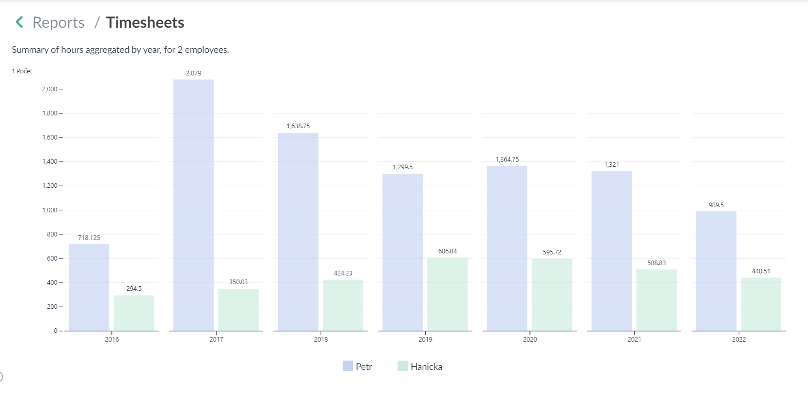
More such sets can be added to the chart. The dataset is again defined from the saved filters. Aggregation (by year, month, day, week) can be used as well.
In the examples below you can see a comparison of the number of hours reported by two users. You can create many variants of such comparison charts.
👉 Learn more here: How to work with custom graphical reports 📺
We hope you enjoy this new enhancement and that it allows you to be a little bit more efficient.